Zempler Bank · 2023
APP FraudPrevention.
Designing Confirmation of Payee: a regulatory-mandated fraud prevention flow that had to feel trustworthy, clear, and human inside a mobile banking app.
Zempler Bank · 2023
Designing Confirmation of Payee: a regulatory-mandated fraud prevention flow that had to feel trustworthy, clear, and human inside a mobile banking app.
01 Project Overview
The landscape of security in personal banking is rapidly evolving, and so are the tactics used by scammers and fraudsters that threaten our customers' financial security. Zempler Bank needed to collaborate with PayUK to introduce new "Confirmation of Payee" and "Purpose of Payment" features that not only enable users to confirm that a payee's details are correct, but to also help educate them on the risks of APP Fraud and to keep their money safe.
Confirmation of Payee (CoP) is a Payment Services Regulator mandate requiring banks to verify that the name on an account matches the payment details the user has entered before any money moves. Done poorly, it creates friction and erodes trust. Done well, it becomes a safety net that customers actually value.
My job was to make sure we landed firmly in the latter category.
02 User Research
Before touching Figma, I wanted to understand how Zempler's customers were actually making payments, and what was going wrong. I led a research sprint combining behavioural data analysis, user interviews, and competitive benchmarking across major UK banks.
The findings challenged some of our initial assumptions.
"I didn't know I'd been scammed until I checked my bank the next morning."
The Micro Business Owner
Primary user · 80%+ of customer base
Tactics used by fraudsters typically revolve around emotional and social pressures, so the measures we put in place need to be strong enough to override that pressure.
We cannot physically be with our users at all times, so we needed to make sure that our users were informed, educated, and empowered to spot fraud.
We cannot legally stop a user from sending a payment, so there is always a risk of slipping through the net, so it needed to be a tight net.
Generic fraud warnings were being ignored across the board. Users had been conditioned to dismiss them as boilerplate rather than reading them as genuine signals.
I compared the "Add Payee → Make Payment" journeys across Barclays, Starling, Lloyds Bank, Santander, Monzo, First Direct, Nat West, and Nationwide.
I mapped the full payment journey across five distinct user archetypes, from the habitual bill payer to the first-time business transfer, to identify exactly where CoP signals needed to land. The journey map exposed a critical gap: the moment of greatest cognitive load was also the moment we were planning to surface the most complex information.
Usability testing on competitor implementations revealed that Match / No Match / Partial Match language alone was insufficient. Users needed to understand what action to take, not just receive a verdict. This became a guiding principle throughout the design process.
03 Starting the Design
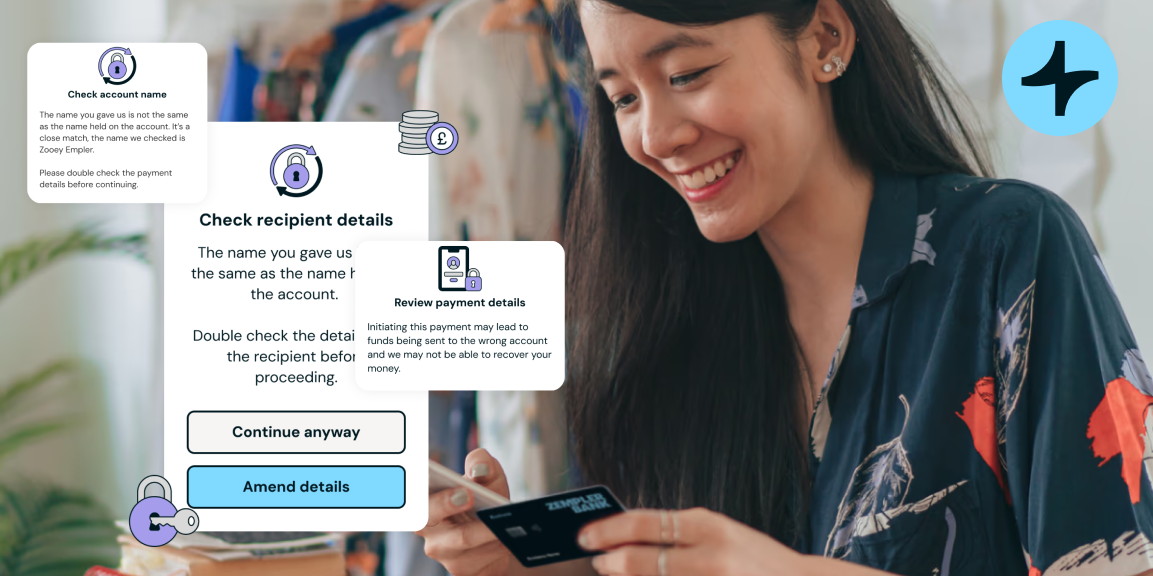
I started by mapping out the full technical logic of CoP. The PSR spec defines four possible outcomes: Match, No Match, Partial Match, and Unable to Check. Each needed its own designed response, and each had different risk profiles. Mapping these before designing ensured the system was coherent, not just individual screens.
Confirmation of Payee isn't a single feature, it's a series of well-timed, considered touchpoints across different payment types, user states, and account contexts. I worked with product to split the scope into shippable phases: new payees first (highest risk profile), then existing payees, then edge cases like international recipients and business accounts. This allowed us to learn from real usage before over-engineering the harder paths.
The biggest design challenge was the "No Match" state. Regulatory guidance required us to show a clear warning, but research showed that overly alarming UI caused users to abandon legitimate payments. We needed to be truthful without being paralysing.
The solution was to reframe the message around action rather than verdict. Instead of "Name does not match," we designed toward "Double-check these details before continuing", surfacing the specific discrepancy and giving the user a clear path, whether that was continuing with awareness or cancelling safely.
04 Lo-fi DesignsWireframes were kept deliberately low fidelity to keep conversation focused on the logic, not the aesthetics. I ran four rounds of internal critique with product, engineering, and compliance before a single colour was applied.
I created an internal usability guide (part pattern library, part decision framework) so that as the feature expanded, every designer and engineer working on adjacent flows could apply CoP states consistently. This documented the four outcome states, their copy principles, visual treatments, and escalation paths.
04 Refining Design
High-fidelity design brought the logic to life within Zempler's existing design system. The four CoP states each needed a distinct visual register: clear enough to be immediately understood, but measured enough not to cause undue alarm.
Colour, iconography, and copy were all treated as functional tools, not decoration. Green for match didn't mean "safe." Amber for partial didn't mean "suspicious." Each state was tested independently with users to verify the mental model it created.
"The goal was calm confidence, not false reassurance. Users should feel informed and in control."
05 Outcome
CoP launched on schedule with full PSR compliance. Post-launch usability testing showed a significant improvement in user comprehension of payment verification states compared to the competitor benchmark we had set at the start of the project.
More importantly, the feature felt like a natural extension of the Zempler app rather than a bolted-on compliance obligation. Something that rarely happens with regulatory work.
Regulatory mandates often feel like constraints, but approaching CoP as a trust-building opportunity rather than a legal checkbox produced a better outcome for everyone. The tightest brief often demands the sharpest thinking.
The biggest design decisions on this project weren't visual, they were about copy. Reframing "No Match" from a verdict to an invitation to verify changed user behaviour more than any visual treatment could have.